Remote Code
Remote code is is when the connected device sends "*.kwl" and some commands before another "*". The commands will
contain one or more of the *.kwl commands described in this section.
After the final "*", the app will return to sending the serial data to the panel elements.
This is a powerful tool to allow the connected device to completely build the panel, delete elements, add elements, or even build another panel if a button is pressed for example.
Using this feature could remove the need for distributing the panel files when sharing your project.
Remote code was introduced in V1.3 of the app. Whilst you can write the *.kwl commands as you go, it is recommended that you copy them from a saved panel file,
or use the remote code generator in the edit mode. The remote code generator can also build a template for Arduino IDE to communicate to a panel you design.
An example of *.kwl commands; sending the the following code as an ASCII string from the connected device will clear the panel,
set the grid size to 10 squares across and 12 down.
Add a button at the top left of the panel which sends 'A' when pressed and 'a' when released. Finally it will tell the app to enter the
run mode before sending "*" to tell the app that it has finished sending *.kwl commands for now.
*.kwl
clear_panel();
set_grid_size(10,12);
add_button(0,0,1,A,a);
run();
*
Remote commands will have no effect when in edit mode.
Note that the *.kwl commands are also found in saved panel files since version 1.3 of the app.
When panels are loaded, the app just runs through a series of *.kwl commands. Therefore this reference
is also applicable to modification of saved panel files. Note that when importing a single panel whilst in edit mode, some commands that effect other panels cannot be used. All commands are applicable to panel files loaded from the main dashboard.
*.kwl syntax
• The commands are lower case with underscores separating the words.• The end of a command is determined with a ; character or newline.
• Arguments/parameters of each command are contained within brackets () and are comma separated.
• Strings are optionally enclosed in quotes "".
• Double slash is used for comments. Anything after // on a line is ignored.
Everything is in effect an ASCII string that we are sending over the serial connection. There is no option for variables or expression evaluation in these commands since the whole command with parameters is in effect just one string. A backslash is usually required before quotes " to differentiate the " character within the string to the quotes at either end of the string. Therefore depending on how/where you use the code, you may need to change " to \".
If a *.kwl command has errors, they are reported on screen and the command ignored.
*.kwl Command Reference
Below is a list of the *.kwl commands, with details of each command following.General commands:
Panel set-up commands:
- set_grid_size()
- set_panel_notes()
- set_panel_title()
- set_panel_line1()
- set_panel_line2()
- set_panel_line3()
Build element commands:
- add_text()
- add_text_box()
- add_button()
- add_switch()
- add_slider()
- add_4way_pad()
- add_8way_pad()
- add_free_pad()
- add_touch_pad()
- add_accelerometer()
- add_led()
- add_buzzer()
- add_gauge()
- add_roll_graph()
- add_xy_graph()
- add_send_box()
- add_monitor()
If a parameter for a command is shown to be enclosed in square brackets [] in the reference below, that parameter is optional.
select_panel(p)
First appeared in App version 1.3This will change the selected/active panel to that specified by p. p is an integer in the range of 1 to 20.
run()
First appeared in App version 1.3This will run the currently selected panel. It is equivalent to pressing the Run button on the main dashboard. If already in run mode, the panel will be re-started clearing graphs, terminals etc.
clear_panel([p])
First appeared in App version 1.3This will clear panel p. p is an integer in the range of 1 to 20. If p is omitted, the currently selected panel is cleared.
Examples:
clear_panel(5); // Clears panel 5
clear_panel(); // Clear the currently selected panel
clear_all_panels()
First appeared in App version 1.3This will clear all panelS. Same effect as going into the main settings and clicking the clear all panels button.
clear_location(X,Y)
First appeared in App version 1.3This will delete the panel element (if any) at grid location X,Y. Grid locations are zero based numbers, such that the top left square is 0,0.
X is an integer in the range of 0 to 39.
Y is an integer in the range of 0 to 29.
clear_area(X,Y,Width,Height)
First appeared in App version 1.3This will delete the panel elements (if any) from an area of the grid defined by the command arguments.
X & Y specify the top left grid coordinate of the area, whilst Width and Height specify the size of the area in grid squares. Grid locations are zero based numbers, such that the top left square is 0,0.
X is an integer in the range of 0 to 39.
Y is an integer in the range of 0 to 29.
Width and Height are positive integers to specify the size in grid squares of the area to clear.
set_grid_size(Width,Height)
First appeared in App version 1.3This will set the grid size of the currently selected panel. Grid sizes can range from (8 x 5) up to (40 x 30). Therefore the Width value must be in the range of 8 to 40 and the Height value in the range of 5 to 30.
Width is an integer in the range of 8 to 40. It specifies how may grid squares across the panel should be.
Height is an integer in the range of 5 to 30. It specifies how may grid squares the panel should have vertically.
Changing the grid size whilst in the run mode will cause the data in any graphs to be reset.
set_panel_notes([Title],[Line 1], [Line 2], [Line 3])
First appeared in App version 1.3Sets the panel notes for the currently selected panel. Title is a string for the panel title. Line 1, Line 2 and Line 3 are optional additional lines of info for the panel. Strings are optionally enclosed in quotes.
Examples:
set_panel_notes("My panel","Does cool stuff",,);
set_panel_notes(Another panel,some info,more info,yet more info);
Alternatively, if only changing one part of the panel notes, one of the following commands could be used.
set_panel_title(Title)
First appeared in App version 1.3Sets the panel title for the currently selected panel. Title is a string containing the new panel title.
set_panel_line1(Text)
First appeared in App version 1.3Sets line 1 of the panel notes for the currently selected panel. Text is a string containing the new line 1 text.
set_panel_line2(Text)
First appeared in App version 1.3Sets line 2 of the panel notes for the currently selected panel. Text is a string containing the new line 2 text.
set_panel_line3(Text)
First appeared in App version 1.3Sets line 3 of the panel notes for the currently selected panel. Text is a string containing the new line 3 text.
add_text(X,Y,Size,Justification,Text,[Red],[Green],[Blue],[Receive Char])
First appeared in App version 1.3This will add a text element to the currently selected panel. Up to 100 text or text box elements can be added to each panel.
X and Y are the grid location of where to place the text.
X is an integer in the range of 0 to 39.
Y is an integer in the range of 0 to 29.
Example: For a 10 by 8 grid, the top left grid location would be X=0, Y=0 whilst the bottom right grid location would be X=9, Y=7.
Size The text size can be "Small", "Medium", "Large" or "Xlarge". Enter as case insensitive strings, or alternatively as integers 0 through 3 instead.
Justification can be entered as "Left", "Center" or "Right". Or just use the initial letters L, C, or R. Also case insensitive.
Red, Green and Blue are integers between 0 and 255 corresponding top the amount of each of those colors. If Red, Green and Blue are omitted, the color will default to white.
Receive Char - Optional, a character which can be used to change the contents of the text by sending "*"+ Receive Char + New Text + "*" over the connection. For example sending "*Acool*" from the connected device will replace the "epic" text of the following example with "cool".
Examples:
add_text(0,0,0,L,”epic”,0,0,255,A); //Writes "epic" in left justified small blue text at top left of screen. Sets "A" as the receive character.
add_text(5,4,Xlarge,Right,"yeah",,,,); //Writes "yeah" in right justified extra large text at grid column 5, row 4.
add_text_box(X,Y,Width,Justification,Text, [Red],[Green],[Blue],[Receive Char])
First appeared in App version 1.3Adds a text box element to the currently selected panel.
Width is an integer containing the width the box in grid squares. Accepted values for width are 1, 2, 3, 4, 6 and 8.
All other arguments are the same as for the add_text() command.
add_button(X,Y,Type,[Press Text],[Release Text])
First appeared in App version 1.3Adds a button element to the panel. Up to 100 buttons can be added to each panel.
X and Y are the grid location of where to place the button.
X is an integer in the range of 0 to 39.
Y is an integer in the range of 0 to 29.
Type is an integer corresponding to the button graphics to be used. Ranges from 1 to 30.
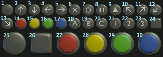
Button types
Press text is the text to be sent over Bluetooth (or whichever connection method is used) when the button is pressed. If no press text is included, nothing is sent when the button is pressed.
Release text is the text to be sent over Bluetooth (or whichever connection method is used) when the button is released. If no release text is included, nothing is sent when the button is released.
Examples:
add_button(4,2,17,B,b); //Adds a blue button which sends "B" when pressed and "b" when released.
add_button(0,0,26,D,); //Adds a large button top left which sends "D" when pressed.
add_switch(X,Y,Type,[On Text],[Off Text],[Repeat Rate],State)
First appeared in App version 1.3Adds a switch element to the panel. Up to 100 switches can be added to each panel.
X and Y are the grid location of where to place the switch.
X is an integer in the range of 0 to 39.
Y is an integer in the range of 0 to 29.
Type is an integer corresponding to type of switch used. Ranges from 1 to 4.

Switch types
On text is the text to be sent when the switch is turned on.
Off text is the text to be sent when the switch is turned off.
Repeat Rate is for the option to continuously send the on text whilst the button is pressed. The value is an integer corresponding to the number of milliseconds between sending the on text (min repeat time is 50 ms). If the Repeat rate is left empty, set to zero or negative, then no repeat send is carried out.
State – The current state of the switch – either on or off.
Case insensitive "on", "true" or 1 will set the switch state to on.
Case insensitive "off", "false" or 0 will set the switch state to off.
Examples:
add_switch(7,3,1,F,E,,0); //Adds a switch at grid coordinates 7,3 initially in the off state that sends "F" when turned on, and "E" when turned off.
add_switch(0,0,2,S,,100,1); //Adds a swith at the top left, initially in the on state that sends "S" when pressed and every 100ms whilst pressed.
add_slider(X,Y,Type,Min,Max,Value,[Start Text],[End Text],Mode)
First appeared in App version 1.3Adds a slider element to the panel. Up to 100 sliders can be added to each panel.
X and Y are the grid location of where to place the slider.
X is an integer in the range of 0 to 39.
Y is an integer in the range of 0 to 29.
Type is an integer corresponding to type of slider used. Ranges from 1 to 8.

Slider types
Min is an integer for the minimum value for the slider.
Max is an integer for the maximum value for the slider.
Value is the current value of the slider. The current value cannot be less than the slider minimum or greater than the slider maximum values.
Start Text (if any) is the text to append before sending the slider value.
End Text (if any) is the text to append after sending the slider value.
Thus we send “start text”+slider value+”end text”. Slider value is sent as an integer. Start and end texts are optional and their usage will depend on the code written for the remote device.
Mode corresponds to whether to send slider data when the value changes, or only when the slider is released. 0=on slider value changed, 1=on slider released.
Example:
add_slider(4,5,1,0,100,50,S,T,1); //Adds a slider at grid coordinates 4,5 with a minimum value of 0 and a maximum of 100. Its initial value is 50, and when the slider is released it will send "S"+slider value+"T" to the remote device.
add_4way_pad(X,Y,[Up],[Right],[Down],[Left],[Release],[Repeat],[Start Text],[End Text])
First appeared in App version 1.3Adds a 4-way pad to the panel.

X and Y are the grid location of where to place the 4 way pad.
X is an integer in the range of 0 to 39.
Y is an integer in the range of 0 to 29.
Up is the text to send when the Up direction is pressed.
Right is the text to send when the Right direction is pressed.
Down is the text to send when the Down direction is pressed.
Left is the text to send when the Left direction is pressed.
Release is the text to send when the pad is released.
Repeat is the option to continuously send the current direction text whilst the pad is pressed. The value is an integer corresponding to the number of milliseconds between sends. (min repeat time is 50 ms). If the Repeat parameter is left empty, set to zero or negative, then no repeat send is carried out.
Start Text (if any) is the text to append before sending the pad values.
End Text (if any) is the text to append after sending the pad values.
Example:
add_4way_pad(0,0,u,r,d,l,o,100,,); //Adds a 4 directional pad at the top left which sends "u" when up is pressed, "r" when right is pressed, "d" when down is pressed, "l" when left is pressed and "o" when the pad is released. Whilst pressed, the pad will send its current direction every 100ms.
add_8way_pad(X,Y,[Up],[↗ Text],[Right],[↘ Text],[Down],[↙ Text],[Left],[↖ Text],[Release],[Repeat],[Start Text],[End Text])
First appeared in App version 1.3Adds a 8-way pad to the panel.

X and Y are the grid location of where to place the 8 way pad.
X is an integer in the range of 0 to 39.
Y is an integer in the range of 0 to 29.
Up is the text to send when the Up direction is pressed.
↗ Text is the text to send when the diagonal Up Right direction is pressed.
Right is the text to send when the Right direction is pressed.
↘ Text is the text to send when the diagonal Down Right direction is pressed.
Down is the text to send when the Down direction is pressed.
↙ Text is the text to send when the diagonal Down Left direction is pressed.
Left is the text to send when the Left direction is pressed.
↖ Text is the text to send when the diagonal Up Left direction is pressed.
Release is the text to send when the pad is released.
Repeat is the option to continuously send the current direction text whilst the pad is pressed. The value is an integer corresponding to the number of milliseconds between sends. (min repeat time is 50 ms). If the Repeat parameter is left empty, set to zero or negative, then no repeat send is carried out.
Start Text (if any) is the text to append before sending the pad values.
End Text (if any) is the text to append after sending the pad values.
Example:
add_8way_pad(0,0,u,1,r,2,d,3,l,4,,,,); //Adds a 4 directional pad at the top left which sends "u" when up is pressed, "r" when right is pressed, "d" when down is pressed, "l" when left is pressed and "1", "2", "3" or "4" when the diagonal directions are pressed.
add_free_pad(X,Y,Min,Max,Mode,[Repeat],[Start Text],[End Text])
First appeared in App version 1.3Adds a round free pad to the panel.

X and Y are the grid location of where to place the pad.
X is an integer in the range of 0 to 39.
Y is an integer in the range of 0 to 29.
Mode can be set to 0 (data is sent as X & Y coordinates), or 1 (data is sent as a magnitude and angle).
Repeat is the option to continuously send the current pad value whilst the pad is pressed regardless of whether it has changed or not. The value is an integer corresponding to the number of milliseconds between sends. (min repeat time is 50 ms). If the Repeat parameter is left empty, set to zero or negative, then no repeat send is carried out and pad data is sent only when its values change.
Start Text (if any) is the text to append before sending the pad values.
End Text (if any) is the text to append after sending the pad values.
Thus we send “start text”+pad values+”end text”. Start and end are optional and their usage depends on the code written by the user of the remote device.
Example:
add_free_pad(5,5,-100,100,1,,P,); //Adds a free pad at grid coordinates 5,5 which sends the magnitude and angle of the pad when touched
add_touch_pad(X,Y,Size,Min,Max,Mode,[Repeat],[Start Text],[End Text])
First appeared in App version 1.3Adds a touch pad to the panel.

Size is an integer holding the touch pad width in grid squares. Valid sizes are 3, 4, 5 and 6.
All other parameter are the same as for the add_free_pad()
add_accelerometer(X,Y,Type,Repeat Rate,[Start Text],[End Text])
First appeared in App version 1.3Adds an accelerometer element to the panel.
X and Y are the grid location of where to place the accelerometer.
X is an integer in the range of 0 to 39.
Y is an integer in the range of 0 to 29.
Type is an integer corresponding to the type of accelerometer to use. Ranges from 1 to 7.

Accelerometer types
Repeat Rate is the number of milliseconds between sending acceleration values (min repeat time is 10 ms).
Start Text (if any) is the text to append before sending the acceleration values.
End Text (if any) is the text to append after sending the acceleration values.
Thus we send “start text”+acceleration values+”end text”. Start and end are optional and their usage depends on the code written for the remote device.
Example:
add_accelerometer(3,1,7,200,,); //Adds a pitch gauge at grid coordinates 3,1 that will send its value every 200ms.
add_led(X,Y,Size,Receive Char,[Red],[Green],[Blue])
First appeared in App version 1.3Adds an led indicator element to the panel.
X and Y are the grid location of where to place the led.
X is an integer in the range of 0 to 39.
Y is an integer in the range of 0 to 29.
Size can be 1 (led takes up one grid square) or 2 (led takes up a 2x2 area).
Receive Char is the character which when the app receives after a * character, it will send the following data to the led indicator until another * character is received.
Red , Green and Blue are the color to set the LED on its creation. All three values are integers ranging from 0 to 255. If the Red , Green and Blue values are omitted, the LED will default to a black color.
Example:
add_led(1,1,2,"L",200,200,0); //Adds a large LED at grid location 1,1 that has an initial yellow color and a receive character "L".
add_buzzer(X,Y,Size,Receive Char,[Sound],Vibrate,[Volume])
First appeared in App version 1.3Adds an buzzer indicator element to the panel.
X and Y are the grid location of where to place the buzzer.
X is an integer in the range of 0 to 39.
Y is an integer in the range of 0 to 29.
Size can be 1 (buzzer takes up one grid square) or 2 (buzzer takes up a 2x2 area).
Receive Char is the character which when the app receives after a * character, it will send the following data to the buzzer indicator until another * character is received.
Sound is either "A", "B", "C", "D", "E" or "None" (case insensitive referring to the choice of sound A, B, C, D, E or no sound as in the buzzer settings). Alternatively integers 1,2,3,4,5 or 0 corresponding to A, B, C, D, E or no sound can be used. If this parameter is omitted, no sound is assumed.
Vibrate can be set to true or false depending on whether the buzzer is to vibrate or not when it is activated.
Case insensitive "on", "true" or 1 will set the buzzer vibration status to on.
Case insensitive "off", "false" or 0 will set the buzzer vibration status to off.
Volume is as floating point number giving the volume percentage (ranging from 0 to 100).
Example:
add_buzzer(0,0,1,b,D,true,50.0); //Adds a buzzer at the top left that when activated plays sound D at 50% volume and vibrates.
add_gauge(X,Y,Type,Min,Max,Value,Receive Char,[Min Text],[Max Text], Major Divisions, Minor Divisions)
First appeared in App version 1.3Adds an gauge indicator to the panel at grid coordinates X,Y.
X is an integer in the range of 0 to 39.
Y is an integer in the range of 0 to 29.
Type is an integer corresponding to the type of gauge. 1 = Dial Gauge, 2 = Thermometer, 3 = Bubble gauge, 4 = Orange Progress Bar, 5 = Green Progress Bar.

Gauge types
Min is an integer for the minimum value for the gauge.
Max is an integer for the maximum value for the gauge.
Value is the current value of the gauge. The current value cannot be less than the gauge minimum or greater than the gauge maximum values.
Receive Char is the character which when the app receives after a * character, it will send the following data to the gauge indicator until another * character is received.
Min Text is text to show at the minimum of the gauge scale.
Max Text is text to show at the maximum of the gauge scale. E.g. “max” or “100”.
Major divisions is the number of major divisions the scale should be divided into. For example a thermometer with a min of 0 and max of 100 and 10 major divisions would have divisions for every 10 degrees.
Minor divisions is the number of minor divisions for each major division. Continuing the example with 10 degree major divisions; 5 sub divisions would give sub divisions at every 2 degrees.
Example:
add_gauge(0,0,2,0,100,20,T,"0","100",10,5); //Adds a thermometer gauge at the top left that has a scale going from 0 to 100 and the current value set to 20. It has major divisions every 10 degrees and minor divisions every 2 degrees and a receive character "T".
add_roll_graph(X,Y,Size,Min Y, Max Y, Points,Receive Char,[Title Text],[X-Axis Text], [Y-Axis Text],Autoscale,Log Y,GridLines,Legend,MaxMin X,MaxMin Y, Line Size, Marker Size,Trace Count,Trace 1 Name, R, G, B, [Trace 2 Name, R, G, B,]....)
First appeared in App version 1.3Adds an roll graph to the panel at grid coordinates X,Y.
There are a lot of arguments in this command corresponding to the options available for the graph in the app. It is recommended to design the graph you want in the app, and then cut and paste the code it generates to your project.
X is an integer in the range of 0 to 39.
Y is an integer in the range of 0 to 29.
Size is an integer holding the width of the graph in grid squares. It can be 3, 4, 5, 6, 8 or 10, corresponding to the 3x2, 4x6, 5x3, 6x4, 8x5 and 10x6 graphs respectively.
Min Y and Max Y are the minimum and maximum values for the Y-Axis. If autoscale is on, then the min and max will vary accordingly once the graph receives data. Min Y and Max Y are floating point numbers.
Points is an integer holding the maximum number of data points to show on the graph. After this number of data points has been received, the graph will start to roll. The number or data Points is in the range 5 to 1000.
Receive Char is the character which when the app receives after a * character, it will send the following data to the graph until another * character is received.
Title Text - optional title text to show above the graph.
X-Axis Text - optional text for the X-Axis.
Y-Axis Text - optional text for the Y-Axis.
Autoscale - Set to "true" or 1 if the Y-Axis should be autoscaled, otherwise set to "false" or 0.
Log Y - Set to "true" or 1 if the Y-Axis should be on a logarithmic scale, otherwise set to "false" or 0.
Gridlines - Set to "true" or 1 if grid lines are to be shown on the graph, otherwise set to "false" or 0.
Legend - Set to "true" or 1 if the Legend is to be shown on the graph, otherwise set to "false" or 0.
MaxMin X - Set to "true" or 1 if the maximum and minimum X-Axis values should be shown on the graph, otherwise set to "false" or 0.
MaxMin Y - Set to "true" or 1 if the maximum and minimum Y-Axis values should be shown on the graph, otherwise set to "false" or 0.
Line Size - Can be set to "None", "Small", "Medium" or "Large". Alternatively integers 0 (None) through 3 (Large) can be used instead.
Marker Size - Can be set to "None", "Small", "Medium" or "Large". Alternatively integers 0 (None) through 3 (Large) can be used instead.
Trace Count is an integer in the range 1 to 8 corresponding to the number of traces for the graph. This also determines how many more arguments will follow. Each trace will have a name, and a RGB color.
Trace Name - a String containing the name of the trace. This will be displayed when the legend is visible.
R , G and B are the color of the trace. All three values are integers ranging from 0 to 255. If left empty, the default graph trace colors will be assigned.
Trace Name and R , G , B are then repeated for all other traces used (determined by the value of Trace Count).
Example:
add_roll_graph(3,1,5,0.0,5.0,100,G,Graph,Reading,Voltage,1,0,1,1,1,1,thin,medium,3,A0,42,97,222,A1,,,,A3,,,); //Adds roll graph with 3 traces and legend as shown below.

Roll Graph
add_xy_graph(X,Y,Size,Min X,Max X,Min Y,Max Y,Points,Receive Char,[Title Text],[X-Axis Text],[Y-Axis Text Autoscale X, AutoScale Y, Log X, Log Y, GridLines X, Gridlines Y,Legend,MaxMin X,MaxMin Y, Line Size, Marker Size,Trace Count,Trace 1 Name, R, G, B, [Trace 2 Name, R, G, B,]....)
First appeared in App version 1.3Adds an X-Y graph to the panel at grid coordinates X,Y.
There are a lot of arguments in this command corresponding to the options available for the graph in the app. It is recommended to design the graph you want in the app, and then cut and paste the code it generates to your project.
X is an integer in the range of 0 to 39.
Y is an integer in the range of 0 to 29.
Size is an integer holding the width of the graph in grid squares. It can be 3, 4, 5, 6, 8 or 10, corresponding to the 3x2, 4x6, 5x3, 6x4, 8x5 and 10x6 graphs respectively.
Min X and Max X are the minimum and maximum values for the X-Axis. If autoscale Y is on, then the min and max will vary accordingly once the graph receives data. Min X and Max X are floating point numbers.
Min Y and Max Y are the minimum and maximum values for the Y-Axis.
Points is an integer holding the maximum number of data points to show on the graph. After this number of data points has been received, the graph will start to roll. The number or data Points is in the range 5 to 1000.
Receive Char is the character which when the app receives after a * character, it will send the following data to the graph until another * character is received.
Title Text - optional title text to show above the graph.
X-Axis Text - optional text for the X-Axis.
Y-Axis Text - optional text for the Y-Axis.
Autoscale X - Set to "true" or 1 if the X-Axis should be autoscaled, otherwise set to "false" or 0.
Autoscale Y - Set to "true" or 1 if the Y-Axis should be autoscaled, otherwise set to "false" or 0.
Log X - Set to "true" or 1 if the X-Axis should be on a logarithmic scale, otherwise set to "false" or 0.
Log Y - Set to "true" or 1 if the Y-Axis should be on a logarithmic scale, otherwise set to "false" or 0.
Gridlines X - Set to "true" or 1 if grid lines are to be shown on the graph for the x-Axis, otherwise set to "false" or 0.
Gridlines Y - Set to "true" or 1 if grid lines are to be shown on the graph for the y-Axis, otherwise set to "false" or 0.
Legend - Set to "true" or 1 if the Legend is to be shown on the graph, otherwise set to "false" or 0.
MaxMin X - Set to "true" or 1 if the maximum and minimum X-Axis values should be shown on the graph, otherwise set to "false" or 0.
MaxMin Y - Set to "true" or 1 if the maximum and minimum Y-Axis values should be shown on the graph, otherwise set to "false" or 0.
Line Size - Can be set to "None", "Small", "Medium" or "Large". Alternatively integers 0 (None) through 3 (Large) can be used instead.
Marker Size - Can be set to "None", "Small", "Medium" or "Large". Alternatively integers 0 (None) through 3 (Large) can be used instead.
Trace Count is an integer in the range 1 to 8 corresponding to the number of traces for the graph. This also determines how many more arguments will follow. Each trace will have a name, and a RGB color.
Trace Name - a String containing the name of the trace. This will be displayed when the legend is visible.
R , G and B are the color of the trace. All three values are integers ranging from 0 to 255. If left empty, the default graph trace colors will be assigned.
Trace Name and R , G , B are then repeated for all other traces used (determined by the value of Trace Count).
Example:
add_xy_graph(3,1,5,0,100,0.0,5.0,100,G,Graph,Reading,Voltage,1,1,1,1,1,1,1,1,1,thin,medium,3,A0,42,97,222,A1,,,,A3,,,); //Adds xy graph with three traces
add_send_box(X,Y,Size,[Text],[Start Text],[End Text])
First appeared in App version 1.3Adds an send box to the panel at grid coordinates X,Y.
X is an integer in the range of 0 to 39.
Y is an integer in the range of 0 to 29.
Size is an integer corresponding to the number of grids squares the send box takes up in the x-direction. It can be 3, 5 or 8.
Text is a String containing the initial contents of the send box.
Start Text (if any) is the text to append before sending the send box text.
End Text (if any) is the text to append after sending the send box text.
Example:
add_send_box(2,2,8,"mush",,); // Creates a 8 grid square wide send box at grid location 2,2 with an initial text of "mush".
add_monitor(X,Y,Size,[Receive Char],Mode)
First appeared in App version 1.3Adds an monitor to the panel at grid coordinates X,Y.
X is an integer in the range of 0 to 39.
Y is an integer in the range of 0 to 29.
Size is an integer holding the width of the monitor in grid squares. It can be 3, 5, 6 or 8, corresponding to the 3x2 (5 rows of 16 character), 5x3 (8 rows of 28 character), 6x4 (11 rows of 35 character) and 8x5 (14 rows of 48 character) monitors respectively.
Receive Char is optional and can be used to send text selectively to monitors if required. The receive character, when received after a * character, will cause the monitor to receive subsequent serial data until another * character is received.
Mode determines if either sent data, received data or both is shown in the monitor terminal. Mode is an integer in the range 1 to 3. Mode = 2 (show sent), Mode = 3 (show received) or Mode = 1 (show both).
Example:
add_monitor(0,0,3,,1); // Adds a monitor to show sent and received data