Editing a Panel
To edit a panel, select one form the main screen and tap on Edit.
This opens up the edit screen from which the panel elements can be added, removed or edited. The panel
can also be exported/imported and a library with ready made panels accessed.
Edit Screen
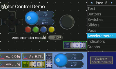
The edit screen is split into different areas. The top left shows a representation of the panel at three quarters size. Each panel is divided into a grid of squares. All panel elements will be of sizes that are a multiple of the square size. The grid is shown with an array of dots. All panel elements will be snapped into this grid.
Panel Number
The currently selected panel number is shown at the top right of the screen. The arrows to the left and right allow you to navigate to other panels.Menu List
On the right is a menu with a list of items that can be added onto the panel, and further options for clearing the panel, import/export, edit panel notes, open up the library of ready made panels, change grid size or create remote code.Properties Region
At the bottom right, when an element is selected (highlighted in blue on the panel), some of its properties are shown and an edit button appears so that you can edit them. Alternatively other buttons such as calibrate accelerometer will be shown depending on the selected menu item.Select Type Region
When one of the element types is selected either in the panel or menu list, the bottom of the screen shows the types of that control available.Adding an Element
Select the type of element you want to add from the menu, and then then select which one you want from the range than appears at the bottom of the screen. Drag it onto the panel to a suitable location.Removing an Element
To remove an element, select it and drag it off the panel area.Moving an Element
To move a element, hold an drag it to where you want it to be. It will be highlighted in green whilst it is being moved. If there is insufficient room at the destination location, it will snap back to where it came from. If you drag it off the panel, it will be deleted.Editing an Element
To edit the properties of an element, select it so that it is highlighted with a blue background. The properties region will show an edit button which will open up a dialog allowing the properties of that control to be edited.Copy, Undo, Redo
None of these features are implemented. If you want to copy the panel to another slot, export it and then import it where you want it.Panel Notes
In the menu, selecting panel notes, will show a few optional lines of text to attach with the panel that wont be shown on the run screen. Click on edit if you wish to change them for the selected panel.Clear
Clears the panel. First select clear from the menu, then select Yes.Library
If Library is selected from the menu, then it opens up another screen with a series of ready made examples. Navigate them with the arrows and select copy to panel if you find one you want to use.Import/Export
Import and Export will load or save the current panel to file in the keuwlsoft directory. As of version 1.50, this is now located in the documents folder as a keuwlsoft/be sub directory. This keuwlsoft/be directory will be located in "storage/emulated/0/Documents" or something similar, where storage/emulated/0/ usually just corresponds the root (or home) directory of your device. On selecting Import or Export, a file dialog will appear to let you create a new file, or choose from the files in this directory. Import and Export is only to this directory, so if you wish to import a panel make sure it is put in this directory. Even if you put a file in this directory, for newer Android versions it may not be accessible - In which case open the file with a text viewer, select all, copy, and use the from clipboard option to import the panel. After which you can save and load it as normal.Grid Size
The quantity of controls you can put on the panels depends on the grid size. When the app is first run it will initially auto pick a suitable grid size based on your screen. However the size of the grid can be individually set for each panel by selecting grid size from the menu. Each panel can have a grid size of between 8 and 40 across and from between 6 and 30 squares vertically. With grid size selected from the menu, a slider appears allowing you to adjust the grid size. With one slider, the aspect ratio is kept to closely match your screen. With two sliders (tap the settings button to the right of the slider to change), the X and Y sizes are adjusted separately. If importing/exporting panels and some of it is off screen, or only appears only in the top left, then it may have been designed on a different device/grid size, in which case change the grid size to suit.Remote Code
This menu option brings up a code generator. Introduced in V1.3 of the app, it will generate code which when sent from the connected device will build the panel. This provides a way to share your project without the need to also share the panel files you have created with each user. The code template it can generate is also a good way to quickly start working on your project.By sending "*.kwl" from your project, the app will interpret panel commands until another "*" character is received, after which it reverts back to sending data to the relevant panel elements.
For example, the following code will clear the panel and add a button at the top left of the panel which sends 'A' when pressed and 'a' when released. See the Remote Code section of this user guide for detailed description of all the *.kwl commands.
*.kwl
clear_panel();
add_button(0,0,1,A,a);
*
By selecting the Plain Text option and then clicking generate code, the string that needs to be sent from the connected device to build the panel is created. By Selecting Arduino IDE, this string is formatted into an Arduino program. The build panel will be located inside the setup() block, such that without further modification, the program will build the panel each time the device is reset. There is an option for adding a delay after each send, or to limit the packet size (the number of bytes in each send). Tweaking these settings might make the panel build more reliable. For example, if using Bluetooth low energy, you might want the packet size not to be greater than the BLE characteristic size. The Channel option gives 5 different serial chanel options. By default "Serial" is used. However if using an Arduino Mega, you might want to use Serial1, 2 or 3, or alternatively use a software serial.
In addition to the panel build, there is an option to build a template based on the elements in your panel. If this check box is selected, the loop() part of the program will be populated with code to communicate with the elements on you panel. The code generated or not generated will depend on the settings for each element.
Once the remote code has been generated, there are several ways to transfer it. The save button will open up a dialog box allowing the code to be saved to the documents folder in a keuwlsoft/be sub directory in ASCII format. The copy button will copy the code to the clipboard ready for pasting in another application.
An example: to transfer the code into the Arduino IDE on a Windows computer:
1) Connect the android device to the computer in a file transfer mode. 2) Open up the saved file in a text editor (e.g. Notepad),
3) Ctrl-A, Ctrl-C to select all the code and copy it. 4) Open the Arduino IDE and Ctrl-V to paste it in there.