Control Types
Controls have been grouped into 9 different types: texts, buttons, switches, sliders, pads, accelerometers, indicators, graphs and terminals.
These types will now be discussed one at a time:
Texts
The text element can be set to be a static string, or receive strings from the Bluetooth serial link. Default text, Justification, color, and optional receive string can be set in the edit mode by selecting the string and tapping the edit button to bring up the text options.If the Android device receives a "*" character followed by the receive character given in the text settings, then it will take the received string upto another "*" character and place that text into the text box. For example if a text box is set up with the receive character "T", then a string of "*Thola*" will place the string "hola" into the text box. The same format is used for graphs and indicators with the character after the "*" character determining which element the data is directed to. If more than one element has the same receive character, then the data is sent to both elements. If the text has an empty receive character, it is static and just shows the default text entered in the settings.
There are 10 different versions of the text element. The first 4 options have different text sizes, whilst the later 6 have different box sizes and constrain the text to within the box. The non-constrained text elements will only take a 1x1 space on the grid and any text in them may overlap other elements on the panel. For this type, select the 1x1 box with an A in it to move/edit the text element.
Buttons
Buttons will send a string over Bluetooth when they are pressed and/or released. Add one of over 20 button styles from the edit screen by dragging them onto the panel. There are two button sizes: 1x1 squares and 2x2 squares. Select a button in the edit mode to see the send and release strings in the properties area at the bottom right of the screen. Tap the edit button to change these strings.Switches
Switches toggle between two values when pressed. The pressed state is remembered on exiting the app. The turn on text is send over Bluetooth serial link when the button is turned on. The turn off text is sent when the button is turned off. In the switches settings, there is an option to send the turn on string continuously whilst the switch is in the on state. If the repeat send is selected then the string will be sent at the repeat time specified. The minimum repeat time is every 50ms and there is an approximate 25ms error in the repeat time.Sliders
There are 8 slider options to choose from:- Horizontal sliders of two designs and two lengths (4 squares or 8 squares)
- Vertical sliders of two designs and height of 4 squares.
- 360 degree rotatable control
- 270 degree knob

Slider Options
Slider values are integers and take values ranging from the slider min value to the slider max value. For example, if the slider min value is 4 and the max value is 8, then the slider can take values of 4, 5, 6, 7 or 8. The slider max and min values can be set in the edit mode by selecting the slider and clicking on the edit button. The default values for min and max of a new slider are 0 and 100 respectively, or 0 and 360 for the fully rotatable control.
When the panel is first run, the app will send the current slider values on the Bluetooth link. The values are then subsequently sent either on the slider value changing or on touch release of a slider as selected in the edit slider settings screen.
The format of the sent string is the starts with start string, followed by the slider value and then ending with the end string specified in the slider settings screen. For example if the start string is "A", the slider value 47 and the end string "*"then the complete string "A47*" is sent. The start and end strings can be longer than one character if preferred or left as empty strings depending on how you have programmed your electronic device to interpret the data.
Pads
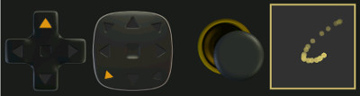
Pad Options
Pads are touchpad or gamepad controls that will either send touch location in the pad or the direction being pressed. Pads can be set up to send a message every time it changes, or continuously whilst it is held pressed at rate specified in the settings for the pad. In addition to sending the location information or direction message, the strings can be appended at start or end by further strings as specified in the settings for the pad. The first two pads only allow 4 or 8 directions respectively. The remaining pads will allow X and Y values within the pad to be sent. The X-Y are determined from the max and min values for the pad. The number of possible positions across the width is (Max-Min+1) . The same applies for the vertical direction of the pad, with the top corresponding to the min value and the bottom to the max value. Position values are integers and any touch will be rounded to the nearest integer position in the pad. Imagine the pad divided up into a grid. If min=0 and max=4. Then there will be 5 possible positions in the x direction and 5 possible directions in the y-direction making a grid with 5x5=25 possible positions.
In addition to returning the X and Y grid locations, there is the option to send back the Magnitude and angle of the touch relative to the center of the pad control. If the magnitude and Angle mode is selected, then the control will send an integer value for the magnitude and and angle rounded to the nearest degree. The maximum magnitude is limited to (max-min)/2.
The 4-direction pad whilst touched, moving touch to a different direction will cause that directions message to be sent and so on until the touch is released and the release message is sent. The 8-direction pad will also send messages for diagonal directions.
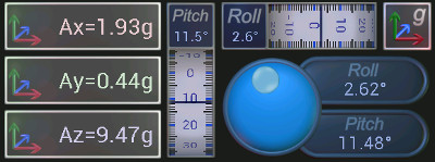
Accelerometers
There are 7 types of accelerometer control. When included into the panel, the accelerometer sensor reading from your Android device will be sent over Bluetooth. This can be set to be send on accelerometer reading update, or continuously at a set interval. If at a set interval, this can be set in the edit screen, by selecting and editing the accelerometer properties. The minimum repeat interval is every 50ms and there is an approximate 25ms error in the repeat time.The accelerometers can be set to send start and end strings to wrap the reading which will be comma separated floating point values. The number of values depends on the accelerometer control being used. The format of the data is shown on the edit screen in the properties region when the accelerometer is selected.
Accelerometer Options
If no accelerometer is selected whilst the accelerometer menu item is selected, then the properties region has a calibrate accelerometer button. Clicking on this will allow the orientation of the device relative to the accelerometer to be calibrated. Calibration is stored for the next time the app is run. Calibration involves taking an accelerometer reading with the Android device flat and vertical.
Indicators
There are 7 types of indicators available in the form of lights, buzzers, dial gauges, temperature gauge, bubble gauge and progress bar gauges.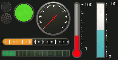
Indicator Options
The Light colour can be changed by sending the Light receive character followed by a RGB color. For example, if the receive character is "L", then sending "*LR0G255B0*" will set the light color to green. Note that the string needs to end with a "*" character to tell the app to process the command. The red, green and blue values are integers between 0 and 255.
The buzzer indicator will play a sound when its receive character is sent. For example if the receive character is "S", then sending "*S*" will make the buzzer sound. There are three buzzer sounds to chose from by editing its properties in the edit screen. If the string sent to the buzzer includes a "V", it will adjust the volume based on the number after it. For example sending "*SV50*" will play the sound at 50% volume and leave the buzzer volume at 50%.
The dial gauge has a needle whose position can be changed by sending the receive character followed by a new value. For example if the receive character is "G", sending "*G25*" will set the needle value to 25. The value sent is an integer. The direction the needle will point will then depend on the gauge max and min value set in the edit properties screen. The max and minimum texts can also be set, as can the number of divisions to show on the gauge.
The temperature gauge, bubble gauge and progress gauges are just variations of the dial gauge and work in the same way.
Graphs
There are two types of graphs, rolling graphs and X-Y scatter graphs. For each type there are 6 size options available ranging from 3x2 grid squares up to 10x6 grid squares.For rolling graphs, only the Y-data is sent to the graph, comma separated for each trace to be plotted. Values are send as floating point values. The string needs to start with "*" and the receive character and end with the "*" character. For example, if the receive character is "G" and has two traces, sending "*G1.24,2,41*" will update the graph with a new data point of 1.24 for trace 1 and 2.41 for trace 2.
For X-Y scatter graphs, both X and Y data is sent. The characters "X" and "Y" proceed the values. Comma is used to separate values for multiple traces. For example, if the receive character is "G", sending "*GX2Y7.4,X3Y8.5* will add another data point to trace 1 at X=2 and Y=7.4, and a new data point to trace 2 at X=3 and Y=8.5.
Sending "C" will clear the data on either type of graph. For example if the receive character is "G", sending "*GC*" will clear the graph data.
The maximum number data points allowed in the graph can be set from 5 to 1000. If the the graph data is full, it will start overwriting the oldest data first.
For both types of graph, the Y-Axis can be displayed as a logarithmic or a linear axis as specified in the graph settings. The graphs can also be made to autoscale based on the data received, or kept fixed to the maximum and minimum values entered in the settings. The X-Y scatter graphs can auto have an autoscaled or logarithmic X-Axis
The graphs can have a title and axis texts and can be entered in the graph settings dialog. If no title string is used, then the graphing area will be bigger.
The maximum and minimums for each axis are shown (or not shown if draw axis max and mins is not selected in the edit graphs dialog) below, or to the side of the axes.
There are up to 8 traces per graph, each trace can have its own name and colour, marker and line size. Edit these in the graphs settings in the edit screen.
The legend is shown to the right of the graph or not shown if the show legend checkbox is not selected. If no legend, max or min values or titles are shown then there will be more room for the graphs, but you will need to let users know what they show by other means.
The graphs can have grid lines. Both major and minor grid lines will be shown. Grid line spacing is calculated automatically.
Terminals
There are two types of terminals, send terminals and monitor terminals. These are useful for debugging, or displaying multi-line scrolling text.Send terminals allow the user to enter a custom text and send it over Bluetooth every time send on that control is pressed. Send terminals can be appended with strings to the start and end of the entered string if required. These values can be changed in the edit screen by selecting the send terminal and clicking on edit.
Monitor terminals listen to the incoming and outgoing data on the Bluetooth link and display it. Blue strings represent outgoing data and white strings represent incoming data. There are 4 size options for the monitor terminal ranging from 3x2 grid squares (5x16 characters) up to 5x8 grid squares (14x48 characters).
The monitor terminals can be set to only display incoming data, outgoing data or both. When receiving incoming data, the terminal can be set to only display data followed by a receive character. Edit these settings by selecting the monitor in the edit screen and clicking on edit.